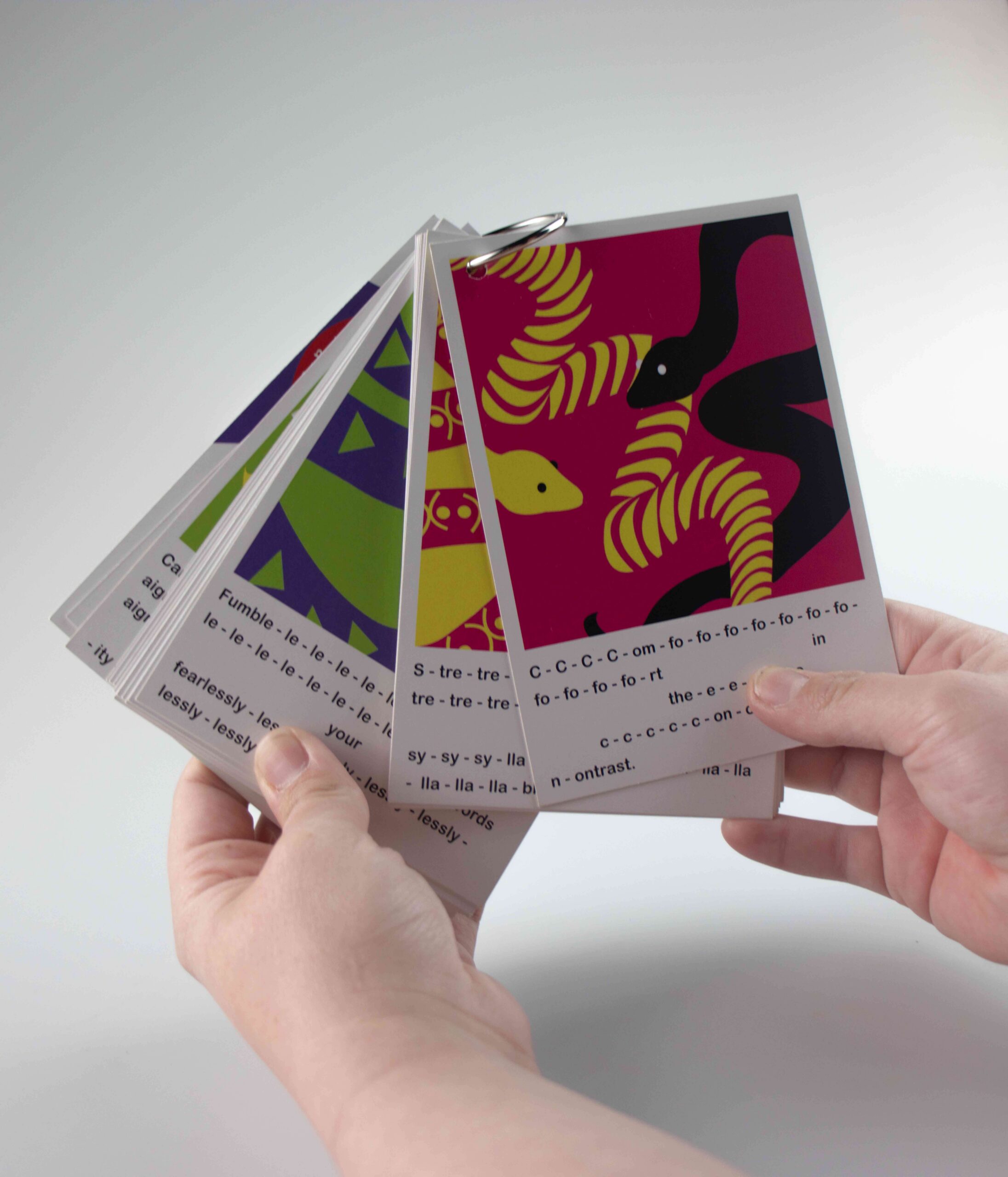
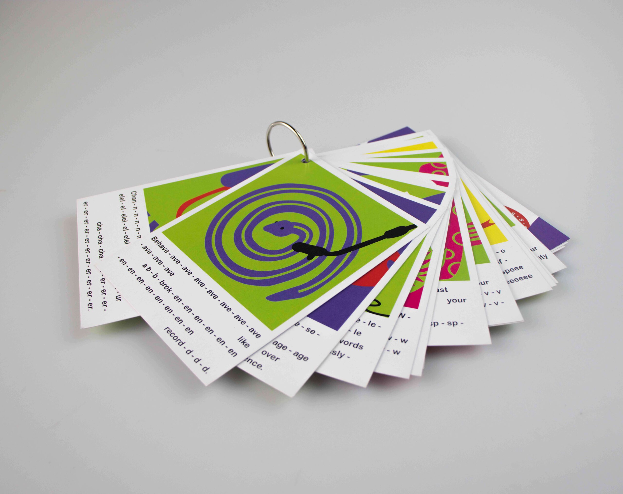
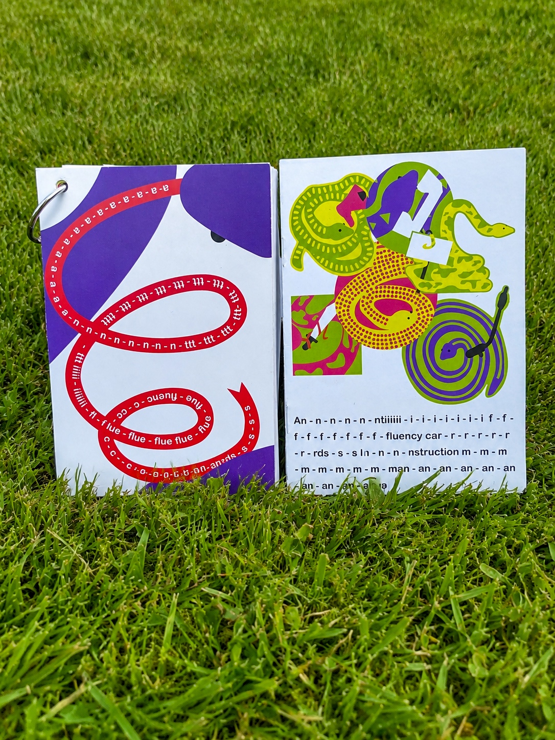
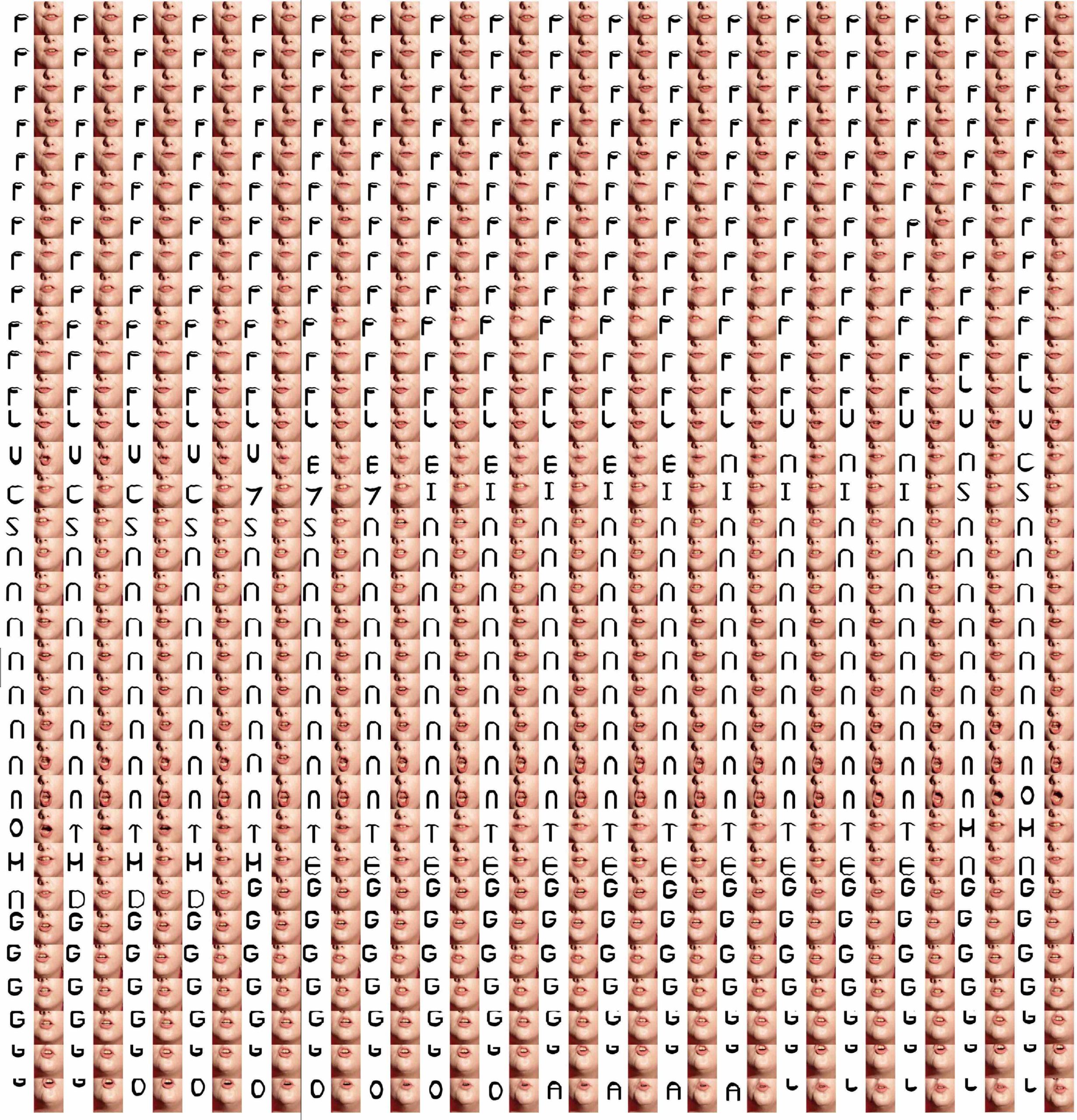
My video ‘Deconstructing Fluency’ uses over 400 unique letterforms to showcase non-conformity within stammering through the medium of motion design. I designed these letterforms in accordance with the shape and movements of my mouth as it twists, locks, and jerks while speaking. Each letterform has been designed with no automation involved. Every video taken frame by frame to ensure that each movement of my mouth is designed for. Ultimately my video serves as a typographic visualisation of the unique speech pattern of a stammerer that should be a cause of celebration not discrimination. It asks the question, why do I have to change my speech to fit into society's standard for 'perfect speech'? Along with my video, I made Anti-Fluency Cards which are a critique in response to the therapeutic tools and assets used across speech therapy currently that encourages stammers to be ashamed of their natural speech. Anti-fluency cards are cards designed to be stutter-affirming. I designed these cards to mimic the child-friendly look of traditional fluency cards. Featuring colorful snakes with unique patterns that twist and turn like a stammerer's speech pattern. From the outside it appears like any regular speech therapy asset with a glossy card, a rounded arial font and colourful illustrations. Unlike standard speech therapy tools, my cards use affirmations and statements prompting users to reflect on practicing non-conformity within stuttering. Phrases like ‘Wrestle with your words’ and ‘Broadcast your bumpy speech’. These phrases have also been designed to match my own speech pattern to further commit to the non-conformity theme. Along with the collection of cards I designed an instruction manual to further assist users in how to approach and use these cards in their lives.