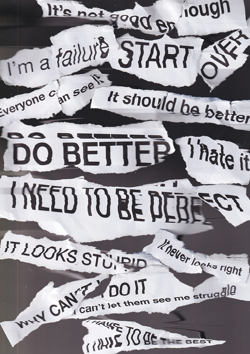
My final year project is called "The Perfect Guide to Imperfection" and it is a personal typographic poster series that examines the journey from self-criticism and control to creative freedom and acceptance. I was inspired by the Japanese philosophy of wabi-sabi and the art of kintsugi, to highlight how imperfections can become the most meaningful aspects of creative work. My series features five typographic posters, each exploring a different stage of my unlearning or learning throughout the process: 1. Distorted Perspective Features scanned typography distorted to reflect how perfectionism makes me see myself and my work through a lens that is totally distorted. I used Helvetica here as a “perfect” typeface, representing that desire for things to look right. 2. Destruction and Undoing created this poster with crochet and I designed it to be destroyed on the day, as it reflects the frustration that comes with undoing and starting work over and by allowing others to destroy it allows me to face my perfectionism. 3. Fear of Losing Control - Here I made the typography to look like it's being highly controlled by me the puppeteer trying to make things perfect, until there becomes a breaking point and control has been lost. My fear becoming a reality 4. Just Create - Poster created intuitively with the type being revealed after messing making symbolising finding the meaning in the process. 5. There is Beauty in Imperfection - This is my resolution poster inspired by kintsugi as the canvas is mended back together using kintsugi techniques and embellished typography holding the poster tightly. This is where I've discovered that there is beauty in imperfection I just needed to change my perspective to see it. I wanted this to feel like a quiet realisation for the viewer and hid the text within the word imperfection to encourage others to change their perspective. Throughout the series, I used tactile materials such as crochet, beaded embellishment, paper mâché, among many other mediums. By combining these with expressive typography and analogue processes, I wanted to create something more textured and organic than just digital design. I allowed for threads to hang loose, for materials to overlap, and for imperfections to become part of the final poster. It’s a deliberate choice I made to highlight the value of imperfection and worth in the handmade. Rationale and Problem-Solving - The main challenge for me was resisting the urge to correct or perfect each poster and to just let myself create intuitively. I embraced a hands-on approach combining tactile materials and digital design in a way that feels authentic and impactful. In the Destruction and Undoing poster, I intentionally designed the crochet work to be destroyed, a physical act of letting go on the day of exhibition. Each poster is different yet connected in colour and theme, showing how imperfection can be a source of strength, not a flaw. Conclusion - This project is a reminder that true creativity isn’t about perfection but it’s about embracing vulnerability, authenticity, and growth. The project celebrates the idea that the most meaningful work often comes from what we first see as imperfections. Ultimately, it’s progress, not perfection, that makes work truly meaningful.